Context
Campaign Monitor's resource hub featured thousands of articles that ranked high in google search and drove a large part of organic traffic, but the hub itself had a problematically high bounce rate, and low average session time.
I led a project to overhaul resource archives and reorganize complex taxonomies into a more intuitive and easy to navigate format.
Results
Over the 2-3 months following the launch of the redesign, Campaign Monitor saw a 2X raise in site visits as well as a 50% drop in bounce rate on the resource hub pages.
Identifying issues through user flow analysis
During an audit of the experience and examination of user flows within Google Analytics I identified a couple primary issues:
A surplus of navigation options causes choice paralysis
Content is buried and difficult to find
SEO for archive pages is competing internally
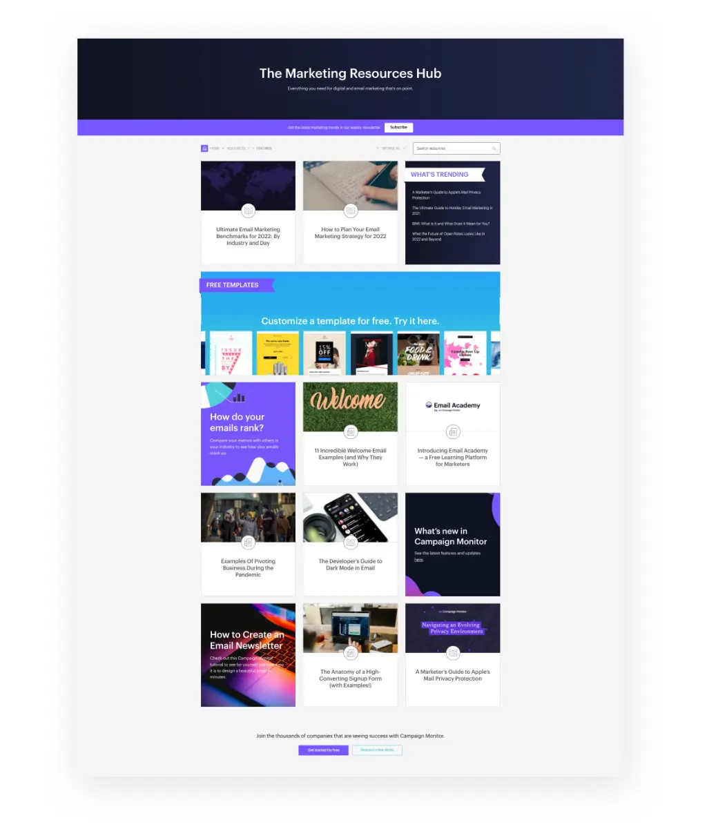
Below you can see the original resources landing page. Lots of different layouts make it hard to focus, and the "what's trending" section (which should have high precedence) does not stand out.
Complex taxonomies lead to abandonment
The resource taxonomy system was the core of the problem. Many outdated options created a confusing experience for users trying to filter content or see a particular category.
The site had separate menus for post format, category, topic, industry, and, and type. Obviously the distinction between these was murky at best.
To make matters worse, selections of one taxonomy would disable selections from another with no notification to the user. This made it highly frustrating to browse since it was never clear if filters would be additive or destroy your previous selections.
Overly complex filtering options:
Streamlining the experience
I worked with the content marketing director and an SEO specialist to understand what taxonomies would be most beneficial to the editorial team, as well as our end users. We also considered how we could safely streamline without losing search authority and traffic.
.jpg)
Ultimately, I landed on distilling the organizational taxonomies into format and topic.
Format was the most often utilized filter by visitors in the legacy design (according to Google Analytics data), showing a desire to browse by this attribute. We also heard from users directly that format was often the first filter they would look at and that being able to narrow in on videos vs. written content etc. was important.
Topic was the most granular sorting from the legacy portal that existed and made sense to keep from a semantic organization perspective.
I also added a live type search, providing instant feedback to help users quickly find specific articles without an extra page load. I theorized this would reduce reliance on filters in general, and help people find what they were looking for faster.
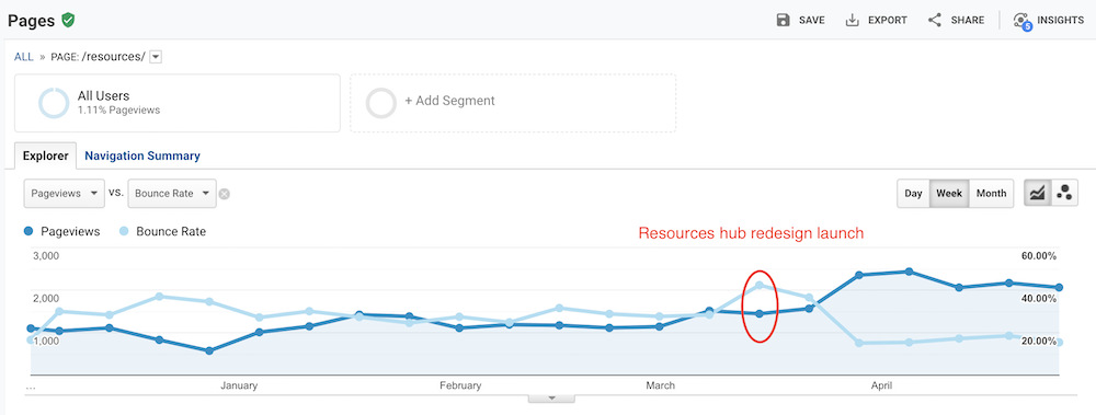
Acquisition and retention spike post-launch
In addition to simplifying the custom UI, the redesign massively streamlined the backend for the content marketing team - with only a single taxonomy to manage that spanned across content types.
Over the 2-3 months following the launch of the redesign, Campaign Monitor saw a 2X raise in site visits as well as a 50% drop in bounce rate on the resource hub pages. It's not always the case that you have such a clear validation of a redesign in site analytics, so we were excited to see the clear impact this project had.