I've been increasingly interested in network mapping as an ethnographic technique for uncovering community insights.
There are some very powerful packages out there for creating network maps, but I found many were focused on statistical analysis and unintuitive for more qualitative exploration. Gephi is a great open source tool, but is over-powered for many situations and the interface makes it exceedingly difficult to do simple tasks like accessing the underlying data for any given node.
My goal with this project was to build a lightweight browser-based tool that could quickly map out a network in 3D space and allow easy manipulation and exploration for general users.
A simple demo examining partisan YouTube
Below is an example of data collected from the youtube channels of Trevor Noah and Bill O'Reilly. I scraped suggested videos from each channel (in incognito mode to avoid targeting) to look at the partisan relationship and reveal what kind of content gets surfaced across party lines.
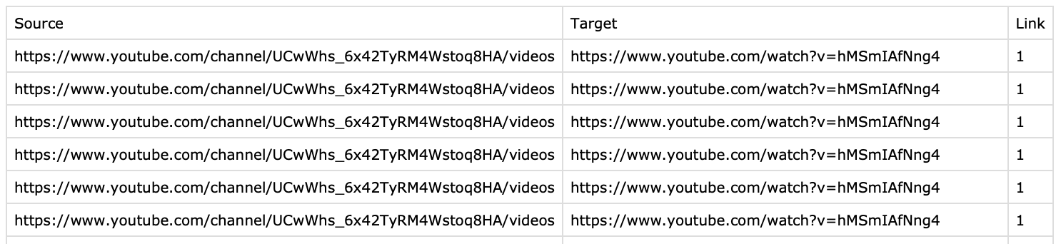
There are a lot of ways to capture network data, but I feel like node list is the simplest, so for the initial build of my visualizer I only support CSVs in this format.
I also currently only support undirected networks, but have an active branch to add directed support as well.
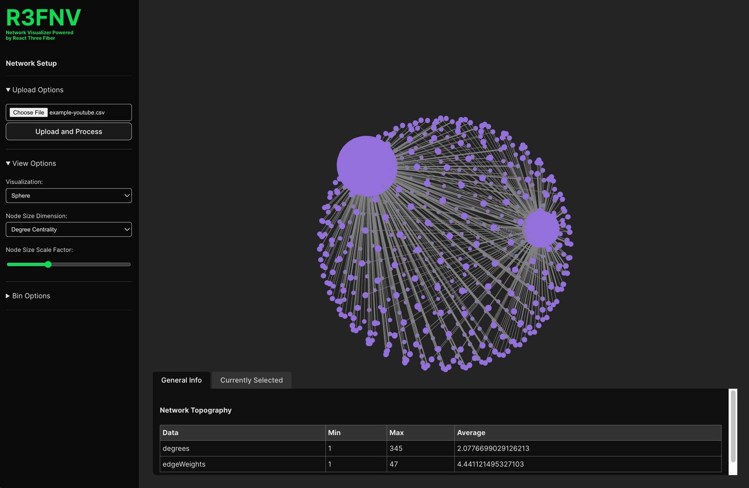
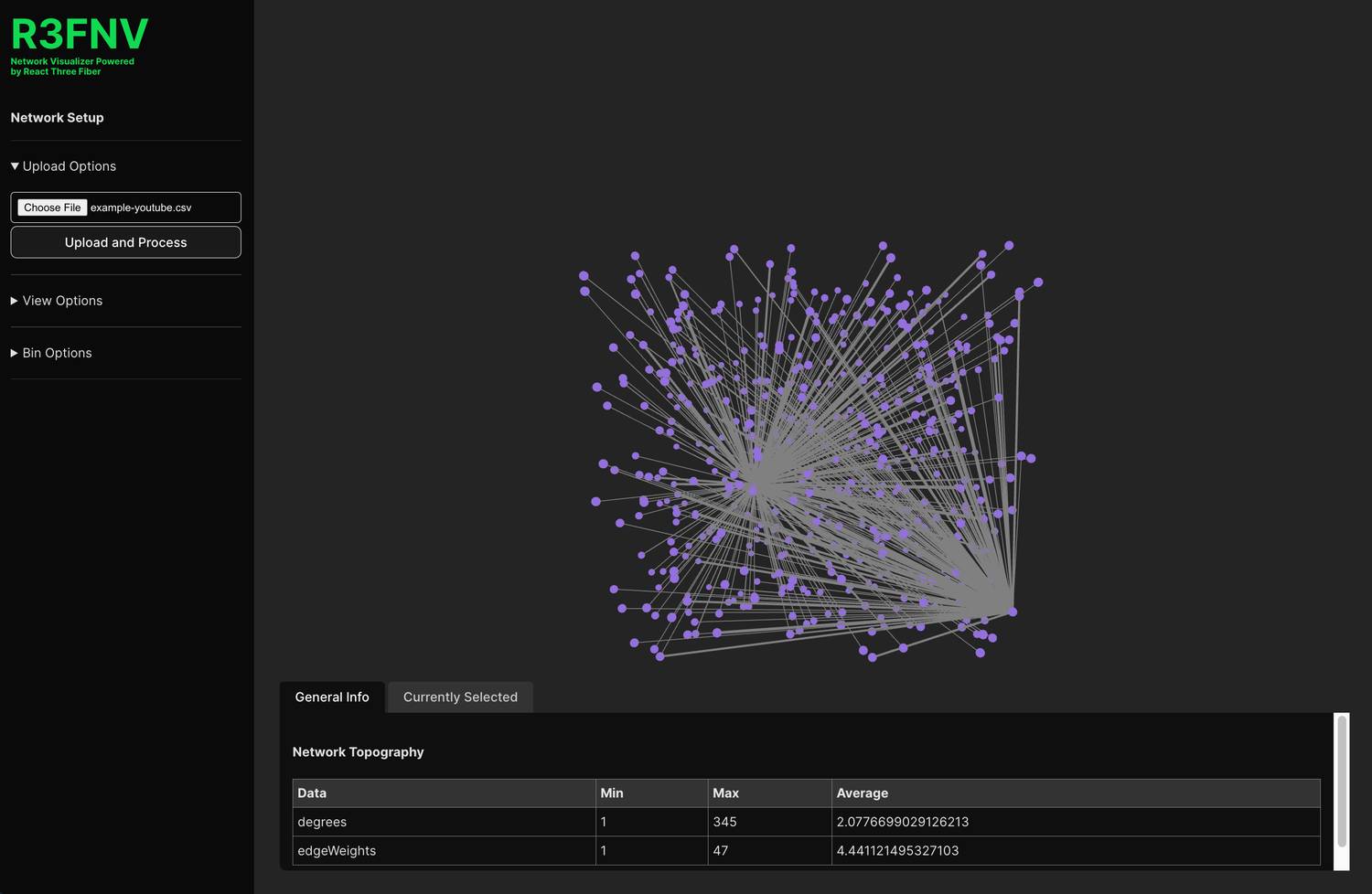
Viewing the initial network
Upon initial load, all the nodes (videos) get scattered in 3D space with edges (suggested links) connecting them. A bottom panel reveal some general information about the network like the min/max/average number of degrees (links) per node, and the min/max/average weight per edge.
Revealing insights with spatial options
To really start diving into the network, several options are available that I find to be the most useful for qualitative exploration.
First, you can edit the projection of nodes. Instead of random, you can choose a sphere to project the nodes evenly around a sphere which helps visualize connections a bit better.
I'm also working on a "force-directed" option which will help reveal clusters. Gephi has a great function for this in 2D space that I am hoping to emulate.
Looking closer at nodes
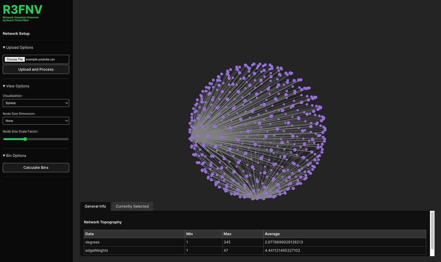
Next, you can assign features to the node size. Right now the two options are degree centrality and eigenvector centrality (which I find to be the two most common things to look at during early data exploration). A slider allows you to adjust the multiplier to fit your dataset.
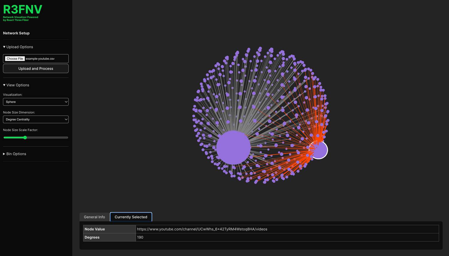
Clicking on nodes reveals reveals all the edges connected to a given node. Also, in the bottom info panel you can quickly see the underlying data of that node - in this case the youtube link, so that you can examine anomalies easily.
Binning data by degree
In addition to assigning node size to a feature, you can also activate binning. Right now I only support degree based binning, but plan to add more dimensions with future updates. This assigns colors programmatically based on degree level groups.
Note: A big issue with color-based binning is accessibility. I have a few ideas on how to handle this including shape based bins for low bin counts, and the ability to selectively hide bins, so that even if colors are indistinguishable the user can select the bin they are interested in and hide all the others.
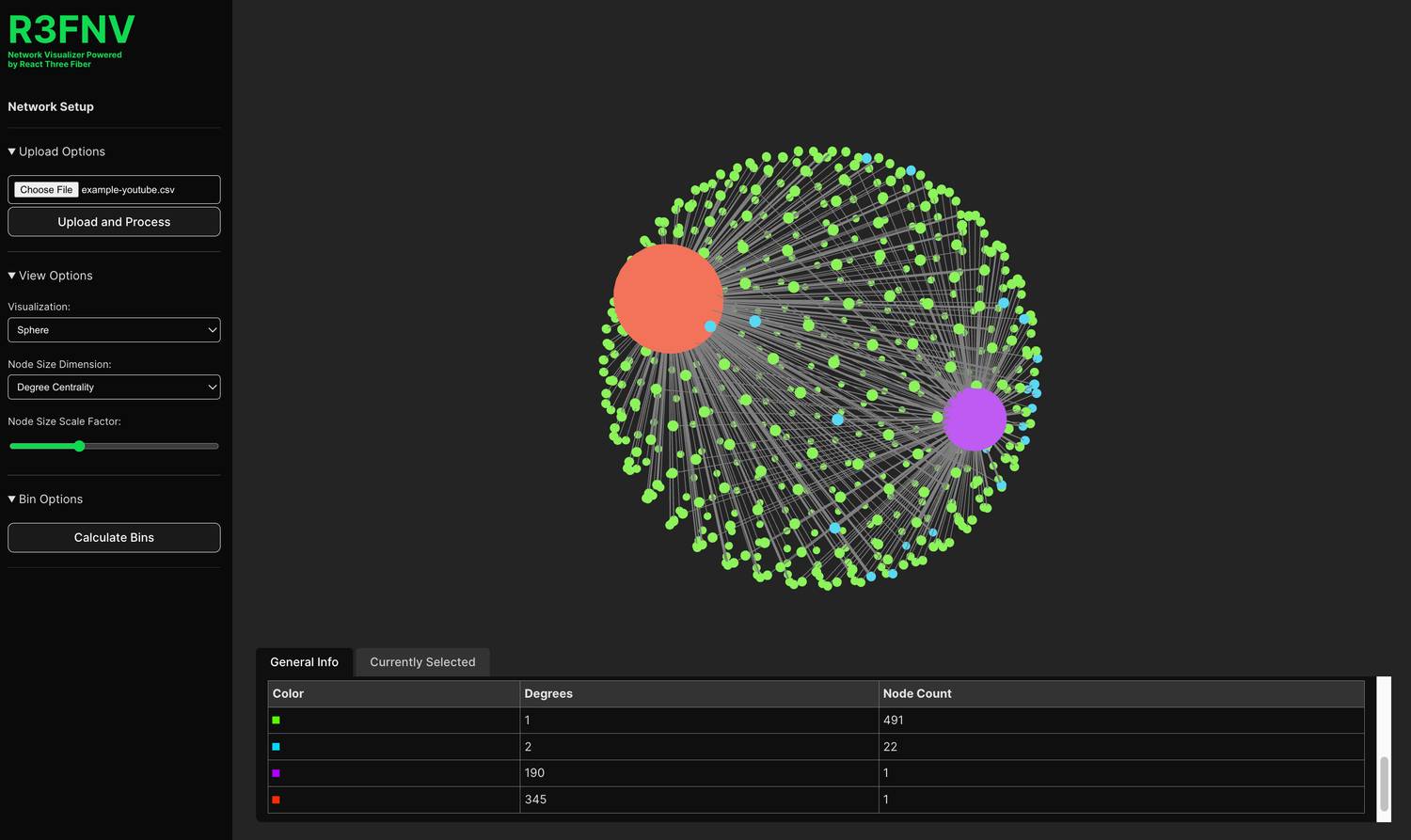
In this case, we can now identify the nodes with 2 degrees by color, which highlights videos that are linked by both primary channels under examination and can give us the type of content that crosses over party lines.
Future directions
There is a lot still to add to make this a more useful data analysis tool, but even in its current state I'm pleased with how natural and easy it feels to explore networks visually.
The biggest priority right now for me is to figure out a solution for force directed layouts to help reveal clusters automatically.